
Why LGBTQ+ Safe Spaces Need Visual Signifiers
We’ve all seen it: the clock strikes midnight on June 1st, and suddenly every corporate logo is draped in a rainbow. While visibility is a start, true inclusion isn’t a seasonal marketing campaign: it’s a design philosophy.
For the LGBTQ+ community, entering a new space often involves a subconscious "safety check." We look for subtle cues to determine if we can truly relax or if we need to keep our guard up. This is where brand design and intentional environments play a massive role.
Subtle, consistent visual signifiers do more than just look inclusive; they act as a silent handshake, letting queer folks know they are seen, respected, and welcome.
Here are six ways design can signal safety beyond the rainbow:
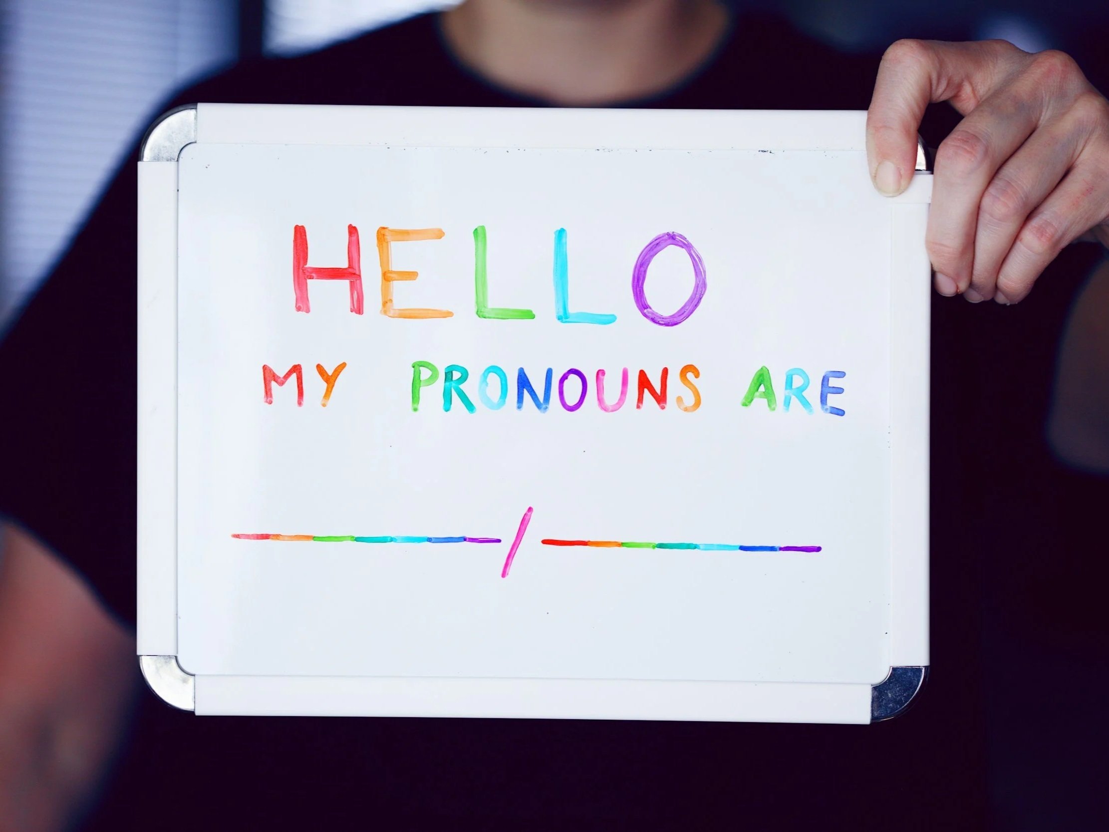
👤 1. Normalizing Pronoun Identifiers
One of the simplest yet most effective signifiers is the integration of pronouns in professional assets. When a company includes pronouns on business cards, email signatures, and LinkedIn profiles, it signals that gender identity is respected here. It removes the "burden of explanation" from non-binary and trans individuals and sets a standard for intentional communication from the very first touchpoint.
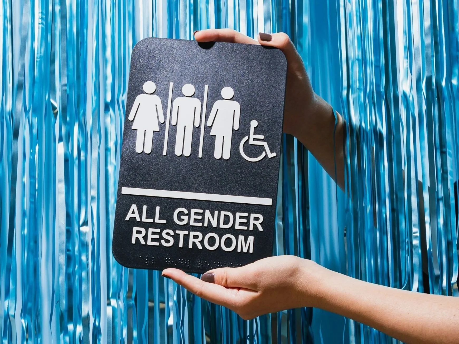
🚻 2. Inclusive Wayfinding & Signage
In physical spaces, "all-gender" or "gender-neutral" washroom signs are a major safety indicator. Moving away from traditional binary icons to more inclusive, descriptive signage tells a visitor that the brand has considered the comfort and safety of all bodies. It’s a functional design choice that carries a heavy emotional weight.

🖼️ 3. Diverse Imagery & Representation
Authentic representation in photography and illustration should be year-round, not just during Pride Month. When a brand’s website or social media features a diverse range of gender expressions and family structures as a default, it tells the viewer that their reality isn't a "special case": it’s part of the brand’s everyday world.

📝 4. Intentional Language in User Experience (UX)
Safety is often found in the details of a form or a checkout process. Does your "Title" dropdown include Mx.? Does your "Gender" field offer more than a binary choice, or better yet, a text-entry field? When digital spaces are designed with this level of intentionality, it proves that the brand's commitment to inclusion isn't just aesthetic—it’s structural.
🎨 5. The Use of Subtle Coding
Sometimes, the most resonant signifiers aren't the most obvious ones. Using colour palettes inspired by specific pride flags (like the trans, bi, or lesbian flags) in a brand’s secondary graphics can act as a "nod" to those in the know. It’s a way of saying, "We understand the nuances of this community," without relying only on the six-colour rainbow.

🤝 6. Public Values & Advocacy Badges
Does your brand highlight partnerships with local LGBTQ+ organizations on its "About" page? Do you display "Safe Space" stickers or digital badges that link to your actual inclusion policies? Showing the receipts of your advocacy through visual badges gives weight to your design. It tells the community that the welcoming atmosphere is backed by real-world action and accountability.
The Takeaway: Design as an Act of Empathy
Inclusive design is about more than "not being offensive"; it’s about being active in your hospitality. By moving beyond the Pride Month rainbow and integrating these signifiers into your core brand identity, you create a space that doesn’t just claim to be safe: it proves it at every touchpoint.
When we design with intentionality, we aren't just making things look better. We’re making the world a little easier to navigate for everyone.